It’s important to start this blog by saying that I am a huge Apple fan and supporter. I started my career in UX design at Apple in 1989 creating icons for OS 7. I have created thousands of icons over the years and two of the OS 7 icons I designed for Apple even received patents. I’m giving a blunt critique of the new icons created for iOS 7, but bear in mind that I do believe the design style they are aiming to achieve has merit. I just don’t think this suite of icons have been executed well and here is why.
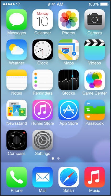
iOS 7 Launch Screen
Overall Design Style
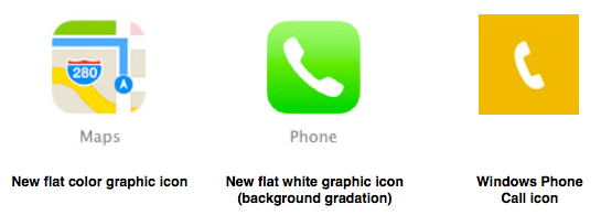
The design style Apple has chosen for the iOS 7 icons follows the current popular software design trend using flat graphics and bright colors. Apple set the trend for mobile device design in 2007 and sadly, now in 2013, they are following design trends. They have attempted to create their own version of flat icons, by using simple flat color graphics on flat backgrounds or backgrounds with slight gradations. This new design direction can be very interesting and differentiating, but they kept their solid white graphic icons for apps like Mail, Phone, and the App Store. The only thing that distinguishes the flat white icons from Microsoft Mobile icons are the rounded corners and slight gradations on the backgrounds. The new suite of iOS 7 icons are a hodgepodge of disjointed graphics, colors, execution quality, and innovation.
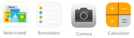
Best of Breed
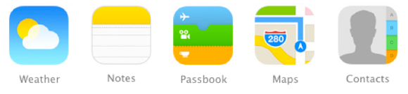
These icons best represent the design style for the new suite of iOS 7 icons. They use the flat color graphics, have clear metaphors, and are well drawn. There are nice subtleties to the icons that make them stand out as professional graphics, like the slight gradations that show depth between the tickets in Passbook and the tabs in Contacts. Together these look like a deliberate set of icons. They use the same color palette and they are drawn consistently, as if they had been cut from colored paper.
Design Consistency
Apple took the liberty to change all their graphically rich icons to flat graphics, so they could have also changed all icons to adhere to the new icon design style. The iOS 7 icons look like they were each designed by their product teams with only loose adherence to new icon design style guidelines. This certainly isn’t a suite of icons that represent a brand strategy created and deployed with strong leadership.
Design Execution
The design execution of the iOS 7 icons is inconsistent. Most of the icons, even those that deviate from the design style, are very well drawn, but some of the icons look like placeholders or as though they were designed by junior designers without oversight. Clearly, these icons are the strongest outliers when it comes to quality.
Metaphors & Communication
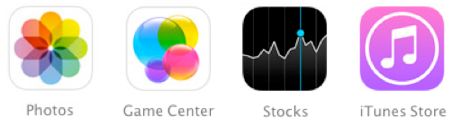
The ability to distinguish between icons is equally as important as overall icon metaphor recognition. I’d even say it can be more important in certain instances. Case in point, the iTunes Store and Music icons, because the only distinguishing elements between them are the circle around the notes in the iTunes Store icon and slightly different color backgrounds. These icons require the users to memorize that a circle around the image means it’s a “Store” icon, which is a horrible metaphor.

We haven’t been told by Apple if this set of iOS 7 icons revealed on Monday is final, so possibly my critique is premature. I have high expectations from Apple regarding icon visual design, and to date for the most part this has been matched or exceeded. When it comes to design there’s a lot of room for opinion and preference and I’m curious to know what you think about these icons.
Thanks!

You must be logged in to post a comment.